The main purpose is convincing a visitor to sign up, buy product or service. We implement creative animations for highlighting the product or service advantages and integrate marketing tools, other useful softwares to collect the analytic information for future marketing goals.
Landing page
Create a landing page for your product or service for the lead generation!
Design
Landing Page
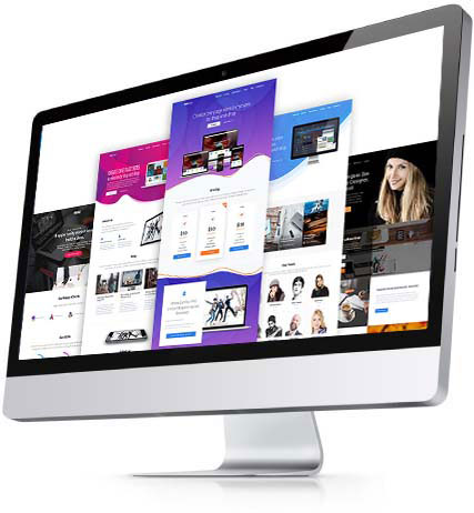
This package is suitable for startups or for companies that already have their own online store for creating special offers or promoting products or services. It includes the unique and modern responsive design that helps to attract clients.
WordPress
Landing Page
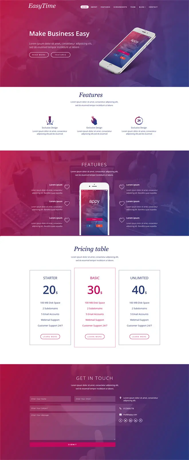
This package is suitable for startups who want to enter a market as quickly as possible and promote a particular product or service with an investment in targeted advertising. It includes the development of the Landing page based on WordPress theme.
Ecommerce
Landing Page
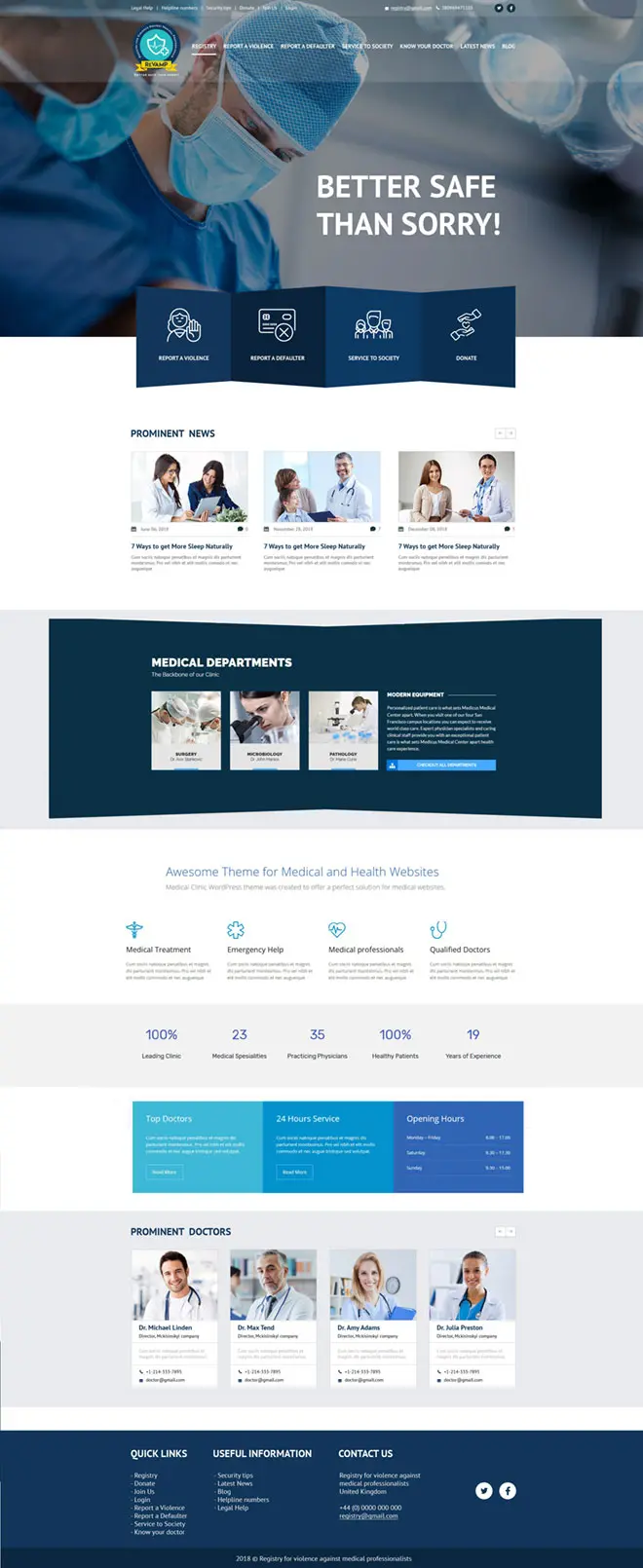
This package is suitable for companies who have already eCommerce business online and want to bring new products or services to the market and promote top products or services in order to achieve maximum profits.
Custom
Landing Page
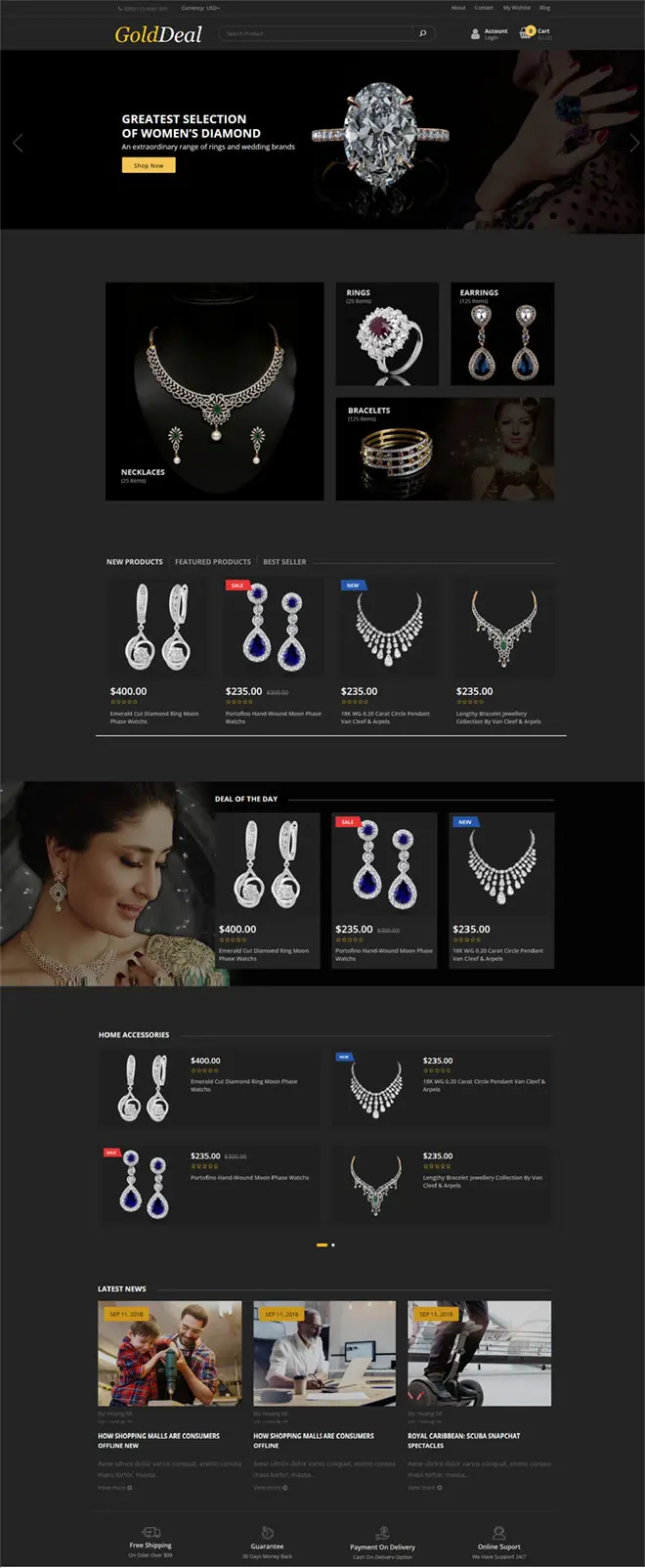
This package is suitable for companies who are looking for promotion their products or services by creating special design by last trends and adding custom effects & animations to reveal the advantages of the unique product or service.
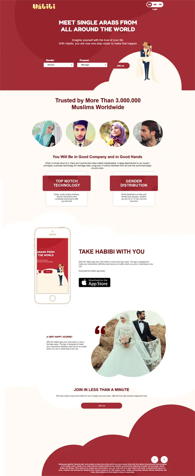
Ready Plans
Design
Landing Page
- Logo design
- Variants of the design – 3 mockups
- Custom responsive (mobile-friendly) layout
- Cross-Browser Compatibility
- Contact form integration
- Google Analytics Integration
WordPress
Landing Page
- Logo design
- Template based layout design
- Default – 5-7 blocks
- Parallax effect
- Custom responsive (mobile-friendly) layout
- Cross-Browser Compatibility
- Content Management System (CMS)
- Google Analytics Integration
- Social Media Integration
- Contact & Subscription/Opt-in forms
- Easy to-use, online user manual
Ecommerce
Landing Page
- Logo design
- Variants of the design – 2 mockups
- Custom – 7 blocks
- Default – 10 blocks
- Additional – 3 inner pages
- Parallax & scroll effects
- Custom responsive (mobile-friendly) layout
- Cross-Browser Compatibility
- Product and Order management system
- Contact & Subscription/Opt-in forms
- Content Management System (CMS)
- Google Analytics
- Social Media Integration
- Easy to-use, online user manual
Custom
Landing Page
- Logo design
- Variants of the design – 3+ mockups
- Custom – 10+ blocks
- Default – 12+ blocks
- Additional – 5+ inner pages
- Parallax & scroll effects,
- Custom animations
- Custom responsive (mobile-friendly) layout
- Cross-Browser Compatibility
- Product and Order management system
- Contact & Subscription/Opt-in forms
- Content Management System (CMS)
- Google Analytics
- Social Media Integration
- Easy to-use, online user manual
Order a unique landing page and increase your conversion
- Three reasons for a landing page
- What is a custom landing page
- landing page conversion
- high-quality landing page cost?
- How does custom landing page design increase profits?
- Website or landing? What to choose?
- How does a landing page differ from a website?
- How to convert a lead to a client?
- Increasing the conversion rate through UI improvements
- The human mind waits for CTA
- How we create landing pages?
- Features and benefits
- Our recommendations
Why create a landing page?
Landing pages are web pages that are designed to collect leads as efficiently as possible – targeted applications from customers who are interested in the offer.
–
There are three main reasons for creating a landing page:
- Product. Sell a specific product or service
- Registration. Motivate the user to register in the service or subscribe to the newsletter
- Installation. Force the user to download a software
The key mission of the landing page is requests or targeted actions: sending contacts to contact the manager, buying, registering, or downloading, that is, the action that will benefit the owner of the landing page. The development of a landing page can help in many cases and is suitable for various areas of commercial activity from retail to the provision of professional services.
The customer landing page brings a steady income on its own. The purchase of a landing page is always associated with increased profits by most companies’ owners.
The belief that the landing page must be long and elaborated is a myth! A proper customer service landing page should be minimalistic and attractive. These are the pages that our agency creates:
- Custom landing page
- WordPress landing page
- Ecommerce landing page
- Landing page design
It is impossible to imagine a successful advertising campaign without a high-quality landing page. And high-quality is not necessarily intricate and complex. In everything, the measure is important, somewhere brightness and saturation with effects are needed, somewhere rigor and conciseness.
There is an opinion that landing pages do not work. This has been talked about for more than five years. Nevertheless, our experience proves the opposite – landing pages are becoming an increasingly effective tool, because now they work not only together with contextual advertising, but also make excellent progress in organic search results.
You can order a landing page and find out in advance the cost of landing page SEO promotion to save on the advertising budget in the future.
Do you want to see the popularity of landing pages development? We recommend looking at the frequency of requests, for example, “buy landing page” and the like, and it will become clear to you that this direction is really in demand.
To get one, you do not need to know how to use a custom landing page builder. Moreover, you do not need to know how to create a custom landing page in general – just order it from us, and we will create a custom landing page on WordPress, WooCommerce, BigCommerce, Shopify, Squarespace, or whatsoever.
Why Webbook Studio?
Webbook Studio holds a leading position in the web design market for more than 10years. During this time, we have helped 500+ clients. Among them are Smart Value Property, ArtistBe.com, Solaris Technologies and others.
The main advantage of our landing pages is high adaptivity – we can build any of the landing page types:
- WordPress custom landing page
- WooCommerce custom landing page
- Squarespace custom landing page
- BigCommerce custom landing page
- Shopify custom landing page
–
What is a custom landing page that works efficiently?
The ideal custom page makes a visitor focus on the product’s pros. It contains a simple application form and does not use any other resources. Landing pages’ main idea is not just to show, but also to describe the advantages of a service or product. It forms a strong will to buy or place an order.
Landing pages on a turnkey basis diminishes the search time for the goods needed by the buyer and reduces the data amount. The landing page represents only one product, and to describe several of them, an equal number of landing pages is required.
What tasks does the landing page solve?
- Conversion rate. Increase in conversion from sales
- The optics. Increase of the brand’s popularity with the Internet users
- Getting a high-precision web tool. Organization of the landing page structure taking into account the target audience’s psychology.
Remember: a well-made landing page will assure you to have a high conversion level. An effective landing page provides fresh ideas that solve classical problems extraordinarily.
–
How landing page will affect your conversion
Webbook studio presents examples of landing pages of large companies with high conversion in the portfolio section. Our team managed to get the conversion rate more than 11%, and 40+ purchases a day.
Sometimes clients are promised to have an immense conversation in just a few days. This is not the case, the result comes with time, but it comes guaranteed. Webbook ensures conversion of 5%+ on the first day of the domain, holding landing page, launch.
Moreover, after the project is completed, our specialists will not leave you alone with your problems: we will analyze the work, promote the landing page, and also analyze the errors that lead to low conversion.
All our pages contain such important components as:
- Competent enticing text
- Unique animations, videos, and photos of high quality
- Properly made advertising banners
Combined, all this will lead you and your company to success and numerous sales.
–
How much does a high-quality landing page cost?
We are often asked such a thing. We suggest that you do not waste time searching for real numbers – most often you will find vague information.
Find out how much it costs to build a custom landing page right now! Just leave a request for a callback or write in an online chat: our managers will promptly answer all your questions and announce the pricing.
The cost of your site customization includes:
- Creation of a unique project by a team of professionals with many years of experience in the field of web design
- Loyal support. We will be in touch 24/7
- Individual analysis of each case. Our conversion optimization specialists will review your website and give advice on increasing sales and attracting customers
Note: all the content that will be used on your landingpage is unique. The texts are compiled by our SEO copywriters, pictures and videos are professionals in working with photo and video editors, and the page design itself is made by qualified web builders.
It is important to remember
that the build price is a payment for a promising passive income on the Internet with no effort needed. If you create a custom landing page in a professional company, the money will pay off in just a while.
The process of creating a landing page with a custom domain
Creating leadpages is a responsible business that requires analytical work, market research, and the activities of competitors in your niche of products or offers.
–
How does custom landing page design increase profits?
Our company’s specialists have implemented more than a dozen successful projects, which you can find out about on our official page, and get acquainted with the reviews of those who have used our services. Among the main known ways to increase conversion are the following:
- Relevant header
- Product demonstration
- Indication of the advantageous sides and positions of your proposals
- Positive feedback from your business customers
- Creating the right main goal
- Awards, licenses, certificates of your proposals to increase the credibility
- The urge to use the CTA button. We will talk about CTA in detail later
- Simplicity and ease of perception of the text
- Providing the most useful main information about you and your offers
- Proper use of psychological techniques of working with the buyer of your offers
Suppose you are the owner of a store or retail chain and you want the demand for some product to increase. What do you need to do in this case? Right, to order a landing page that will promote this product. In this case, a single page will be an excellent tool to support an advertising campaign, increasing its effectiveness. Having learned the key features and advantages of the product, the user will understand that it is profitable for him to make a purchase, especially if the purchase is made as part of a discount promotion or a limited offer. It is no secret that such attraction mechanisms work and are actively used when creating landings.
Sometimes it happens that the customer is not sure whether he wants to use the service (or make a purchase) in this particular situation. The main questions that torment every normal person:
- Do I want to buy this?
- Do I want to buy it now?
- Do I want to buy it here?
Professional landing answers “yes” to all three questions at once. After all, only a professional landing page can highlight your advantages over competitors, emphasize the current benefits of the purchase and show that dealing with your company is easy and pleasant!
The landing page can support the main website of the company, serve as a business card of the product and trademark, or work independently in a separate region or city. The latter function is especially useful, so many entrepreneurs at one time decided to order landing only for narrowly focused promotion. Such one-page sites are called geo-dependent and can provide invaluable assistance when opening new business sites for any part of the country.
Another great feature of landing pages is the ability to adjust the conversion rate.
It is proved that in case of slowing down the pace of business development, it is possible to adjust the visual and textual parts of a single page. After analyzing how this change will affect the sales schedule, you can find the optimal solution and, thus, maintain profitability at the required level.
–
Website or landing? What to choose?
What is the best fit for your online business and what will bring more leads ready to buy anything from you right now?
To begin with, let us define the term itself and start with the landing page. Not everyone understands, even what it is, and even more so they do not understand the difference with the site. Unlike the site, the landing page offers the user to do one thing. Such pages are created for a narrow audience. They can be used effectively in advertising and when you need to focus on something specific – selling, information, an invitation to subscribe to a newsletter, and so on.
If you have a business or your activity is related to people, a landing page will be useful to you. A landing page is useful whenever an offer can be placed on a button. The target action in this case can be anything. You can sell turnkey saunas, online courses on earning money on the Internet, or even a personal forecast from a numerologist.
–
How does a landing page differ from a website?
- As the name says, a landing page is just one page, containing all the necessary information to sell your products or services. Whereas a site is a set of different pages that is bad for the conversion. Why? Just because several pages scatter the visitor’s attention. But landing pages solve this problem effectively — they concentrate all the specially designed information that helps buyers not to distract and find everything they need “on the spot”. Moreover, multiple pages slow down the speed of the site that may affect conversion simplicity. For instance, some clients may get annoyed and bored while scrolling through more than one page and just leave a site buying from another one.
- All the sections of landing pages lead to buying due to its structure — since the information is presented as an essence, usually, there is just no place to add any unnecessary blocks — forum, “about us” section, blog, and other odd stuff.
- Landing pages focus on only one thing — your product or service. As we said before, there is no place, that is why all the media, texts, and design respond to one function — promoting your product. Often it happens that visitors just read or learn something at the site but do not buy or even contact managers at all — this is solved thanks to landing pages that are mostly high conversional.
Types of custom landing page designs
Most landing pages are created to sell a certain category of goods or services intended for a wide audience. But in reality, the possibilities of using such sites are much wider. Here are the main types of landing pages:
- Information pages for collecting subscribers
- Advertising sites for collecting contacts
- Sites for the sale of one product or products of the same category
- Promo sites announcing the event
In recent years, the trend of adding landing pages to traditional sites has been gaining popularity. There are two popular ways to implement this idea. The first is to create a landing-type start page. The second is to make a landing for product pages.
How the landing page works. Attracting users to the site.
Before creating a landing, you need to know the exact answers to two questions. The first is what requests the target audience of the product has. The second is how to position the product. The big advantage of landing compared to traditional sites is the possibility of an experiment.
Facing any difficulties answering these two questions? Our team of professional marketers is rushing to the rescue! Leave a request on the website or contact our manager, and we will help you with choosing the optimal strategy.
If the product has several dissimilar target audiences, you can develop a separate landing page for each TA. Even if TA is one strictly defined group of consumers, then you can create two landing pages as part of A/B testing to find out which page works more efficiently.
After drawing up a portrait of a typical buyer and forming a list of advantages, it is necessary to create contextual or targeted advertising through which visitors will get to the site. The peculiarity of attracting traffic forms another characteristic feature of landing pages: they are always perceived in the context of an advertisement. Relatively speaking, you should not write in a contextual ad: “Buy bicycles”, but devote the page to selling only orange tricycles. This reduces the conversion rate and, accordingly, increases the share of the advertising budget spent aimlessly.
–
How to convert a lead to a client?
Regardless of the degree of familiarity of the Internet user with the product, after visiting the landing, he must act. An action can be a purchase, an order for a callback, a subscription to an email newsletter, etc. For the lead to understand what needs to be done, a special call to action — CTA — is added to the custom landing page design. Most often, the CTA is a button or feedback form.
The CTA buttons have a clear indication of what needs to be done: “call”, “leave a message”, “chat”, “contact us”, etc. The feedback form is the block where the lead leaves his contact details. The volume of the feedback form largely depends on the product. However, it should be remembered that the fewer fields the user needs to fill in, the more willing he will do it.
One of the key questions is how to conduct a lead from the header to the CTA. There is no definite answer. With equal success, you can create a large landing page, at the end of which there is a CTA. Or place a call to action on the first screen. The choice of tactics depends on the product and the awareness of the target audience. If, when switching to landing, the lead knows in advance what he will be offered, it is appropriate to place the CTA on the first screen or in the header. Conversely, if it is necessary to explain the advantages of the product in more detail, it is appropriate to place an appeal at the end of the page.
Conversion of custom landing page design and UI — what is the connection
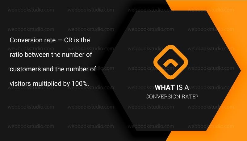
Conversion rate — CR is the ratio between the number of customers and the number of visitors multiplied by 100%. For example, if three clients were received during 100 visits to the page, the conversion rate is 3%. Let us look at how to increase the conversion of custom landing page design using various UI elements.
–
Increasing the conversion rate through UI improvements
When developing a landing, keep in mind the relationship between text content and design. Design is important because, through captivating visual solutions, you can interest a site visitor from the first seconds. Text content is important for an obvious reason: through the text, you can explain to the visitor the need to perform actions.
Many developers make a mistake: they think over illustrations that complement the text. The mistake lies in the fact that the user may get carried away looking at illustrations or get bored from the abundance of visually inexpressive text. For the custom landing page design to be enticing, it is recommended to create a prototype in the following sequence:
- Elaboration of a design that will visually go through the page from beginning to end
- Defining the theme of text blocks on each screen
- Creating a shared layout
- Writing all the missing texts
An unofficial rule says that each screen of the page should contain a maximum of space free of semantic blocks (illustrations, text, infographics, etc.). At the same time, you need to remember the convenient perception of semantic blocks: the font should be easy to read, the pictures should be large enough. Ultimately, the more convenient the page is for the user, the higher the probability that after visiting the site, the lead is converted into a client.
As we have already understood, several teams of professionals take part in the creation of custom landing page design at once. Of course, you can always turn to the help of freelancers to create illustrations or sell SEO text, but it is much better to make a turnkey website from start to finish — especially since it is much cheaper! By contacting us, you get not just a “dry” and an empty page, but a fully working sales tool. Texts, images, videos, and GIFs — our team will do all this promptly, especially for your project.
A landing page remains a simple but very effective way to establish communication with your target audience. Due to its convenience and versatility, landing pages are used by everyone — from international corporations to representatives of local businesses. However, the external simplicity hides a lot of preparatory work. When starting to create any page, you need to perfectly understand your target audience and perfectly navigate the market situation. Our company, consisting exclusively of people who know their business, will help you with this.
Landing page and CTA from the point of view of psychology. What does science think about all this?
Absolutely all marketers know about the call-to-action button, but very few understand the psychology of this component of the landing page.
CTA motivates to perform the target action not only due to the visual design (color, text, button size, and CSS effects) but also due to the impact on the behavioral patterns of users.
Understanding the principles of the impact of CTA on the consciousness of visitors, the marketer becomes a real expert in conversion optimization — knowing even the basic incentives that affect the behavior of buyers allows you to develop an ultra-effective offer.
Today we invite you to take another step towards understanding consumer psychology by familiarizing yourself with the concepts on which the effectiveness of the call to action is based.
–
The human mind waits for CTA
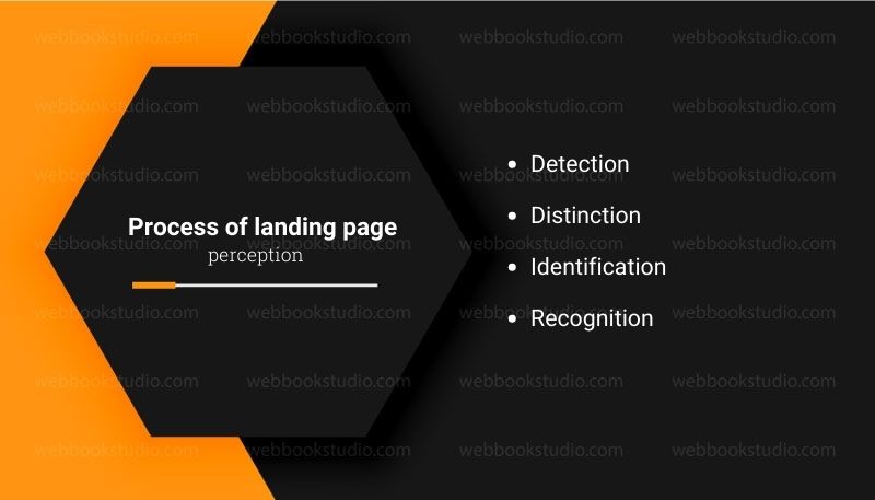
According to the theory of the perceptual attitude, the mind forms a subjective idea of a certain person, object, or experience in the process of perceptual perception, which takes place in 4 stages: detection, discrimination, identification, and identification.
Let us consider the process of landing page perception.
- Detection. The initial phase at which a person discovers a stimulus, which, in our case, is the information on the landing page.
- Distinction. At this stage, the user selectively reacts to a certain sensory stimulus — the monitor screen on which the page is displayed. So, for example, if a person is viewing a landing page while in a cool room, his nervous system will process visual stimuli (the content of the landing page), and not the temperature in the room.
- Identification. After the formation of a perceptual image, a similar model is searched in memory — a person unconsciously remembers landing sites that he visited in the past, and the actions that he performed on them.
- Recognition. At the last stage, the analytical department compares the perceptual model with the image from memory and forms either a new pattern of behavior or copies the one according to which the person acted in the past. In other words, the visitor will either do about the same as he did when visiting landing pages in the past or take a different series of actions.
 The CTA element is part of the logical progression of the landing page, the image of which was formed by the visitor in the past, therefore, when visiting landing pages, he expects to see a call to action. The generated landing page image does not affect the user’s propensity to transform, but determines his behavior — after seeing the CTA button, a person immediately understands what actions he should perform.
The call to action arouses curiosity
Calls to action arouse a sense of curiosity among users — they wonder what will happen after clicking on the CTA button. Curiosity is a strong motive for action since the satisfaction of interest brings pleasure.
Psychologists have developed many theories explaining curiosity, the leading one of which describes this feeling as an ordinary desire that can be satisfied by repeated exposure to stimuli. However, the effectiveness of interest as a motive for acting is based not only on the desire for pleasure but also on a sense of excitement.
The excitement caused by curiosity arises if a person sees, hears, or feels something not fully. Imagine, for example, a child who wants to see what is behind the fence, but cannot do it because the barrier is too high — the child will jump, climb, scream and cry, wanting to satisfy his interest.
Once psychologists conducted a study in which respondents listened to an audio recording, the quality of which periodically deteriorated. The researchers noticed that when the recording was hard to hear, the muscles of the subjects’ arms tightened. The respondents showed an increase in muscle tension, followed by a decline within a few minutes. And here is why.
Unsatisfied interest, based on the desire for satisfaction, causes aversive arousal. The desire to get rid of such tension generates a desire to search for information, which is a basic manifestation of curiosity. Internet consumers know that after clicking on the CTA, they will receive a certain value. But they know exactly what will be presented to them, as a result of which there is an informational dissatisfaction that generates curiosity.
The effectiveness of the CTA element of the subscription form presented below is based solely on the motivation of curiosity.
The CTA element pushes for anticipation
People have an innate tendency to expect certain events: we assume that the alarm will ring in the morning, the email will be overflowing with letters, there will certainly be a traffic jam on the way home from work, etc. The expectation is concentrated in the most primitive and basic part of the brain — the cerebellum.
A few interesting facts about anticipation:
- In most cases, our expectations are embellished
- The process of anticipation gives the same positive emotions as the real experience of getting what you want
- The human mind is inclined to expect positive events — positive experiences stored in the subconscious replace negative ones
There are several effective methods of evoking a sense of expectation:
- Tell a story. From the point of view of psychology, landing is a kind of narrative: the title is an introduction, events develop in the selling text, and the call-to-action button is the culmination that the human mind expects.
- Describe your post-conversion experience as best you can. Describe the benefits and value of conversion in as much detail as possible — the stronger the anticipation of users, the more intense the emotional experience they get on the landing page.
- Evoke positive emotions with the help of content. Anticipation increases if a person is in a positive mood — keep users in a positive mood by presenting interesting photos and information.
CTA strengthens the psychological sense of reward
A person’s behavior is formed following what kind of reward he expects to receive for his actions. After receiving a certain reward for certain actions, a conditional reaction is developed that predisposes to the repetition of the behavior model that brought a certain value.
As a result of repeatedly following the reflex, the set of reactions and actions that it includes becomes a behavioral pattern. Since visitors received some value after clicking on the call-to-action button, they formed a conditioned reflex that pushes them to repeat the past scenario to receive encouragement in the present.
In other words, consumers are used to receiving a reward for performing a conversion, therefore, if there is some kind of reward for conversion, they almost unconsciously click on the CTA, wanting to get value. To strengthen the desire for reward is quite simple: promise potential buyers a reward for completing the conversion path.
Thus, the psychological rationale is behind everything a marketer does, and the development of a CTA element is no exception. Understanding the basic psychological concepts that ensure the effectiveness of the call to action allows you to develop the most effective offer.
By the way, we use all the described tricks not only on our website but even here — in this text. Do you want the same? Our professional marketers will implement all these features on your website at will. All that is necessary is to mark the appropriate item in the brief or simply notify your personal manager.
–
How we create our products
We have been creating landing pages for many years using our own developments and this has allowed us to develop the most effective work plan:
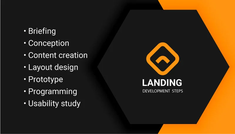
- Step 1. Application. It all starts with a simple application left by you on the site. Managers contact clients within minutes and clarify all the details and wishes of the client
- Step 2. Briefing. We collect complete information about your company. We conduct surveys and study the information provided. Based on it and based on the previously gained experience, we plan the further course of work
- Step 3. Multivariate analysis. Research the niche of your business and the market as a whole to ensure the highest conversion rate
- Step 4. Conception. We are drawing up the concept of the future page and the terms of reference. This is a document that reflects all the technical and marketing subtleties of the landing page. Planning text content
- Step 5. Development of the message structure. The text and general visual message of the lead page play a huge role. It is the landing page that should encourage the visitor to take further action
- Step 6. Content creation, Writing SEO-optimized texts. Based on the prototype, we are working on texts and headings. The page will not go into design until we polish all the information blocks
- Step 7. Design layout. Depending on the agreement, we create one or more design concepts for the future landing page. We listen to your every comment, but we always reserve the last word, because we are convinced that you cannot sacrifice conversion for the sake of meaningless effects. Our developments always have a nice design, but we do not overload our projects so as not to lose the essence of the proposal
- Step 8. Layout. The layout s is the most important part of the project. All elements must behave as intended, and the page adjusts correctly to the screen resolution.
- Step 9. The prototype of the page. We are developing an interactive prototype. This is a schematic representation of the site, where the behavior of all page elements is demonstrated. To create prototypes, we use figma, invisionapp and adobe xd
- Step 10. Programming. Installation of the control system. This is not a mandatory item that we discuss with the customer in advance. If the landing logic implies changing the information, we will equip the page with a convenient administrative panel. As a customer, you can choose absolutely any platform: WordPress, Shopify, WooCommerce, Squarespace, BigCommerce, or everything you want.
- Step 11. Creating a page. Development of modules and the page itself by a team consisting of, coders, copywriters, and layout custom landing page designers.
- Step 12. Texts. Writing SEO-optimized texts
- Step 13. Usability study. The usability of the page plays an important role. How convenient and obvious is the information, the function control menu of the page.
- Step 14. Publication. Hosting the page, testing, identification of problem areas, troubleshooting
- Step 15. Adaptation. Traffic from mobile devices is getting higher every day. In the development and HTML layout, it is very important to take into account how the custom landing page will look on the screen of a mobile device.
- Step 16. Marketing. Adding tools for a successful advertising campaign. Analytics, so that there is data based on which the page will be refined later; methods of instant communication with the manager; scripts for geotargeting and multi-headings; mandatory meta tags so that the page is indexed correctly for brand queries, etc.
- Step 17. Final Launch
Quite a lot, yeah? However, it will take a while to accomplish all the points with our company!
Tip: if you need something unusual, for example, a customer testimonial landing page, you can also trust it to us – we will provide any kind of job!
Turnkey development of landing pages in 7 days is reality!
Our team develops not just attractive Landing pages. First of all, these are effective tools with a set of properties that have been revealed empirically over the years.
–
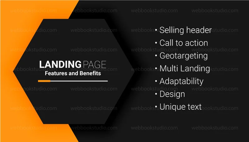
From a large number of such properties, the following tools can be distinguished:
- Selling header (offer, USP). This is the basis of every landing page, its very essence. A clear, catchy, motivating title will become a real seller of your goods or services
- A form of capture with a call to action. It is not enough to write a good title; you need to give it a logical continuation and an opportunity for the user to quickly contact the manager
- Geotargeting. When the page adjusts to the user’s location. The title is automatically substituted, increasing the probability of a positive result from the expectation
- Multi Landing. This is an automatic substitution of the page content, which depends on the user’s search query. Such a mechanism significantly increases the success of an advertising campaign, because the design and content of the page meet the expectations of customers
- Adaptability. This feature allows the landing page to adjust to different monitor resolutions. Thus, it becomes convenient for viewing, both from a mobile phone and from a 27-inch screen.
- Design. The face of your brand is what evokes emotions. It is not uncommon for design to become a key factor in making a final decision
- Text. This is another important component of the page. Surprisingly, people often turn a blind eye to this, although the delivery of information is the primary purpose of the landing page. Of course, it can be conveyed through infographics or videos, but if all this is framed in illiterate text, the effect will be zero
You definitely need a landing page if you are:
- A company that sells goods, services, and information over the Internet
- A marketing agency that studies consumer preferences and forms a buyer’s portrait for certain goods and services
- A public organization that attracts like-minded people to its ranks to meet the criteria for registration and demonstrate its significance for society and the state
- An advertising agency that forms a target audience for a targeted offer of promoted goods and services
- A large company or retailer that forms databases about potential consumers to further offer goods on attractive terms via email, SMS, social networks
- A startup. Companies that are just entering the market and are direly need to get the information about their product
- A manufacture. Companies that bring a product or service to the market or want to come up with the existing ones
- A company with a story. Companies that have been in this market for a long time and are ready to tell something interesting to the world
- Anyone interested in an income increase. Those people already or should know that the digital market is constantly growing day by day
Whoever is interested in a landing page, they are united by one task – to attract an interested Internet user and turn him into a buyer or like-minded person.
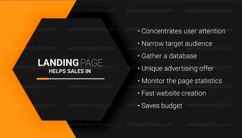
How landing page helps sales
- Concentrates attention on the main thing and purposefully leads to the commission of a specific action
- Gathers an exceptionally narrow target audience, ensuring high conversion
- Allows you to quickly gather an extensive database of interested users
- Clearly forms a unique advertising offer
- Allows you to monitor the page statistics and analyze the conversion
- Makes it possible to control the content of the site and make changes promptly
- Increases the speed of creating, testing, and debugging a ready-made website
- Saves budget: creating a landing page is an order of magnitude cheaper than creating a full-fledged website
What is important when creating a selling landing page?
- To order a landing page that brings maximum conversion, it is important to correctly form a “portrait” of the buyer. It is the definition of the target audience that is the first and most important point for a selling landing page. After all, it is created for an effective advertising offer to specific people
- The second important point is to lead a potential buyer to purchase. He should not doubt that your offer is unique and necessary for him. Here comes to the aid of understanding the principles of psychology and effective marketing
- And finally, you should explain to the buyer as transparently as possible why he should take advantage of your offer. After all, most likely, it is far from the only one on the market. But your task is to present your strengths and weaknesses correctly. Think through all possible objections in advance and work them out on the landing page
- Setting up ads for landing pages
Landing page performs several very important functions:
- Formation of the target audience – attracting interested potential buyers
- Collecting contact details of potential buyers for further communication with them via email, social networks, SMS
- Consistent description of the key characteristics of the product to identify the most significant for the consumer
- Advertising of goods and services
- Sale of the proposed product
Note: a landing page is a modern marketing tool, not a leash, that is attached to a visitor to drive him through the pages endlessly until he fully studies the entire site.
Which landing page is better to order?
Website development is a complex process, especially when it comes to a website that needs to sell. For a website to be effective, it is not enough to be a good web programmer. To implement a real working project, you need to take into account aspects of marketing, usability design and have in-depth knowledge in the field of sales. That is why the price of creating a landing page is very different.
With a limited budget, one of the options to make the project successful is to order a separate landing page design and study the marketing component.
–
The main recommendation we can give:
Never buy ready-made landing pages and do not order a landing page based on templates and constructors. Such decisions will never give a decent result, and most importantly, they will ruthlessly exhaust the advertising budget. Buy landing pages created only to order – such pages will take into account all your interests and needs as accurately as possible, bringing the entire site to the top of requests on the Internet.
By ordering the development of an exclusive website, your chances of success grow significantly.
The purposes of visiting the page can be different: from simple curiosity to a purposeful search for a product or service. But all visitors are united by one thing – interest in the information they expect to receive when they get to the landing page. Therefore, it is very important to attract only interested potential consumers from millions of Internet users to the page. This is how the target audience is formed. And then it remains only with the help of the landing page to convince this audience to purchase a product or service, with which we will also help you.
![]()
I have completed all the preliminary steps, and the landing page is ready. What is next?
Now you have already clearly drawn a portrait of the buyer, tried to dispel all his doubts about the purchase, and are satisfied with the site that turned out. The last steps are left: to make a potential buyer see your landing page and check how effective it is.
To spread your website on the web, and with it your unique advertising offer, we use advertising channels as much as possible. Of course, the best option for landing page promotion is contextual advertising. It is fast and efficient. Do not lose sight of advertising on social networks, targeted and teaser ads. The more customers see your landing page, the sooner it will pay off.
At the same time, it is important to remember about search engine optimization. Yes, landing is just one page, unlike a website, and it is difficult to promote it by SEO, and even more so to get to the top of search results. But don’t forget that there are low-frequency queries in any industry. And for any of them, the site may well be at the top of the search. Therefore, we verify and optimize the content on the page that the search engine algorithms performed the promotion correctly.
In fact, the main job is to adjust the parameters of the site after its launch. For this reason, after we launch your page, you will not be left alone – our team will continue to accompany you to collect statistics and analytics and regulate SEO optimization. We will monitor the behavior of visitors and the effectiveness of the site itself. So, we will definitely bring your site to the top!
Our advantages
We build any type of landing page in the shortest period for a reasonable price, whether it is Shopify, WordPress, WooCommerce, BigCommerce, or Squarespace
What will you get as a result of working with us:
- A web tool in the form of your own custom landing page design. Depending on your choice, the landing page will have a general orientation or narrowly focused on the psychological characteristics of a certain target group, taking into account their values and beliefs, based on the testimonials of leading experts in the field of NLP
- A landing page or custom squeeze page will become your effective tool on the Internet. It will allow you to draw new customers’ attention, quickly and simply distribute and demonstrate the needed information. It will demonstrate your business’ popularity and professionalism
Contact us
Do not know how to build a custom landing page in WordPress but need it? There is no problem! Purchase a turnkey landing page from Webbook Studio and increase the conversion rate of your site right now!
Contact Us


