9 Top Landing Page Design Best Practices for Skyrocketing Conversions in 2025.
Landing page design best practices focus on creating a focused, user-friendly experience that effectively converts visitors into desired actions. Key elements include a clear value proposition, compelling CTAs (call-to-actions), a simple and intuitive design, and mobile-friendliness. Optimizing for speed, using social proof, and A/B testing are also crucial for maximizing effectiveness.
In the fast-paced world of digital marketing, a landing page is your brand’s first handshake with potential customers. It’s the moment when a fleeting click can turn into a meaningful action, whether that’s a purchase, a sign-up, or a lead. But creating a landing page that converts isn’t about just throwing together a pretty design or catchy headline.
It’s about understanding human behavior, leveraging design principles, and staying aligned with the latest trends to make an impact. Landing page design best practices are more important than ever, as businesses compete for attention in an increasingly oversaturated digital landscape.
The strategies, reasons, and examples behind structuring a landing page for maximum impact, while exploring its market value, required skills, and unique opportunities for 2025.
What is a Landing Page? How does It Work?
A squeeze page is a standalone web page designed specifically for a digital marketing or advertising campaign. With a single focused goal to guide visitors toward taking a specific action, such as making a purchase, CTA (Call-To-Action), signing up for a newsletter, or filling out a form.
Unlike a homepage, which serves multiple purposes and offers various navigation options, a single property page is streamlined to minimize distractions and drive conversions.
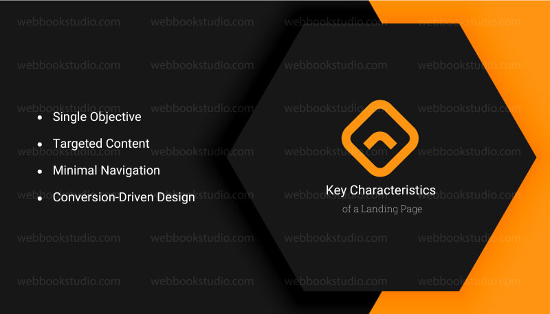
Key Characteristics of a Landing Page;
- Single Objective: It focuses on one call-to-action (CTA), like “Buy Now” or “Get Your Free Trial,” to keep users on a clear path.
- Targeted Content: The content is tailored to a specific audience or campaign, often matching the ad or link that brought the visitor there.
- Minimal Navigation: It typically has limited or no links to other pages to prevent users from leaving before converting.
- Conversion-Driven Design: Elements like headlines, visuals, and trust signals (e.g., testimonials) are optimized to persuade users to act.
Why Landing Page Design Matters in 2025?
The global landing page builders market is booming, valued at USD 715.5 million in 2025 and projected to reach USD 2.72 billion by 2035, with a 14.3% CAGR. This growth is fueled by businesses’ reliance on digital marketing for lead generation and conversion optimization.
Small and medium-sized enterprises (SMEs), in particular, are driving demand, as they often lack in-house developers and turn to user-friendly tools to create campaign-specific pages. The services segment, which includes landing page creation and A/B testing, accounts for 31.9% of the market share, underscoring the need for specialized expertise.
A squeeze page is a standalone web page designed for a specific marketing campaign, guiding visitors to take a single action. Unlike a homepage, which serves multiple purposes, a landing page is laser-focused on conversion.
In 2025, with mobile traffic surpassing 62% of web visits and attention spans shrinking, a well-structured landing page can make or break your campaign. The stakes are high: a poorly designed page leads to bounces, while a strategic one can boost conversions by up to 50%, according to marketing experts.
The Evolution of User Expectations
Today’s users are savvier than ever. They expect intuitive navigation, fast load times, and personalized experiences. Outdated designs or cluttered layouts are a one-way ticket to losing their trust.
Trends like bold typography, calming color palettes, and no-code builders reflect a shift toward user-centric design that feels fresh and engaging. By accepting these trends, you’re not just keeping up, you’re building trust and driving action.
For example, a 2025 landing page for a fitness app might use a bold, sans-serif headline with a soothing Mocha Mousse gradient (Pantone’s Color of the Year) to grab attention while feeling approachable.
9 Proven Key Landing Page Design Best Practices for Maximum Impact.
To create a single property page that converts, you need a structure that guides users naturally toward your business goal. Below are the best nine practices, grounded in logic and backed by examples, to ensure maximum impact.
1. Why Craft a Clear and Compelling Headline Matters?
Landing page design best practices matter in your headline is the first thing visitors see, and it has seconds to capture their attention. A vague or overly clever headline risks confusion, while a clear, benefit-driven one sets the tone. Research shows that headlines with specific value propositions can increase conversions by 20%.
How to Do It: Write a headline that answers “What’s in it for me?” Use simple, direct language that highlights your unique selling proposition (USP). For instance, instead of “Revolutionary Fitness App,” try “Lose Weight in 30 Days with Our Proven Fitness App.” The latter is specific, benefit-focused, and actionable.
Example: Grass Roots Farmers’ Cooperative uses a headline like “Claim Your $30 Off Grass-Fed Meat” to immediately convey value and urgency, guiding users toward a purchase.
However, pair your headline with a subheading that elaborates without overwhelming. For example, “Lose Weight in 30 Days with Our Proven Fitness App” could be followed by “Personalized Workouts and Nutrition Plans Tailored to Your Goals.”
2. Why Optimize for Mobile-First Design Facts?
With over 62% of web traffic coming from mobile devices, a landing page that isn’t mobile-optimized is a conversion killer. Smartphone users have shorter attention spans and expect fast, easy navigation. A mobile-first design ensures your page looks great and functions seamlessly on smaller screens.
How to Do It: Use concise copy with bullet points, large buttons for easy tapping, and a single-column layout to avoid scrolling issues. Ensure images load quickly by compressing them without sacrificing quality. Test your page on multiple devices to confirm responsiveness.
Example: A Zumba instructor training page uses high-res, mobile-friendly photos of people dancing, paired with short, punchy copy like “Start Teaching Zumba Today!” This online site layout is clean, with a sticky CTA button that stays visible as users scroll.
Support: Prioritize mobile-first design by starting with a 320px viewport and scaling up, ensuring your page is functional even on older smartphones.
3. Does It Matter to Leverage Bold Typography and Visual Hierarchy?
Bold typography is a dominant trend, turning headlines into visual anchors that guide users through your page. A clear visual hierarchy using font sizes, colors, and spacing helps users process information quickly, reducing cognitive load and boosting engagement.
How to Do It: Use oversized, expressive fonts for headlines and contrast them with smaller, readable sans-serif fonts for body text. Highlight CTAs with vibrant colors or gradients, like Mocha Mousse fading into beige, to draw attention without overwhelming. Keep sections distinct with ample white space.
Example: A text-only hero section with a bold, 60px sans-serif headline like “Grow Your Business Today” grabs attention, while a smaller subheading and bullet points outline benefits clearly, guiding users to a bright CTA button.
Suggest: Mix serif and sans-serif fonts for contrast, but limit yourself to two font families to maintain consistency.
4. Why Incorporate Social Proof and Trust Signals Facts?
Trust is a major barrier to conversion. Users are skeptical of unfamiliar brands, especially online. Social proof testimonials, reviews, or client logos build credibility and reassure visitors. Studies show that pages with social proof can increase conversions by up to 15%.
How to Do It: Include customer testimonials with names and photos (with permission), or showcase logos of well-known clients. Add a trust badge button, like “Secure Checkout” or “30-Day Money-Back Guarantee,” and create your CTA. Be specific: instead of “Trusted by Thousands,” say “Trusted by 5,000+ Happy Customers.”
For Example, Red Forest IT Farms’ B2B landing page for hemp oil includes a testimonial from a wholesaler praising their “decarboxylated extracts,” which reinforces expertise and builds trust for a niche audience.
Practice: Place social proof near your CTA to address objections just before users decide to act.
5. How Can Used Scarcity and Urgency Tactfully Impact?
Why It Matters: Scarcity and urgency tap into human psychology, nudging hesitant visitors to act quickly. However, fake scarcity (e.g., a countdown timer that resets) erodes trust. Genuine scarcity, like limited stock or a deadline, can boost conversions by 30% when done honestly.
How to Do It: Highlight limited availability with phrases like “Only 10 Spots Left” or a countdown timer for a real deadline, such as “Offer Ends Tonight.” Ensure your claims are truthful to maintain credibility.
Example: A SaaS landing page for a project management tool might say, “Join Our Beta Before It Closes on July 15!” with a countdown timer, creating urgency without feeling manipulative.
Suggest: Combine scarcity with a strong value proposition to make the offer feel exclusive and urgent.
6. Simplify Navigation with a Sticky CTA.
Complex navigation distracts users from your goal. A sticky CTA (call-to-action) button that stays visible as users scroll keeps the conversion path clear. Posts on X highlight that simple navigation with a sticky CTA can significantly improve conversions.
How to Do It: Limit navigation to essential links, like “Home” or “Contact,” and place a sticky CTA button in a fixed position, such as the top-right corner. Use action-oriented text like “Get Started” or “Claim Your Discount.”
Example: Twinwoods Adventure’s landing page for indoor skydiving keeps a floating phone number and “Book Now” button visible, ensuring users can act no matter where they are on the page.
Practice: Test CTA button colors to find what stands out best against your background. Bright colors like orange or green often perform well.
7. How does the support for No-Code or Low-Code Builders Matter?
Landing page design best practices in 2025, no-code and low-code platforms are democratizing target page creation, allowing non-technical users to build professional business pages quickly. These tools save time and reduce costs, making them ideal for SMEs and startups. The low-code market is expected to grow to $16.5 billion by 2027, reflecting its rising popularity.
Choose a builder like Unbounce or Wix, which offer drag-and-drop interfaces and pre-optimized templates. Look for features like A/B testing, analytics, and smartphone responsiveness. Also, ensure the platform integrates with your CRM or email marketing tools.
Example: A small e-commerce brand uses Wix to create a landing page for a seasonal sale, dragging and dropping a Mocha Mousse-themed template with a countdown timer, all without coding.
Practice: Start with a template backed by conversion data, then customize it to match your brand’s voice and style.
8. Why Personalize for Your Audience Facts?
Personalization can increase conversions by up to 50%, as it makes users feel understood and valued. In 2025, AI-driven personalization is a game-changer, allowing dynamic content tailored to user behavior or demographics.
How to Do It: Use AI tools to display personalized CTAs, images, or offers based on user data, like location or browsing history. For example, a visitor from New York might see “Join Our NYC Fitness Challenge,” while a California user sees a different localized offer.
Example: An e-commerce landing page for a clothing brand shows winter coats to users in cold climates and swimsuits to those in warmer regions, increasing relevance and clicks.
Suggest: Start with simple personalization, like using a visitor’s first name in email-driven landing pages, and scale up with AI as your budget allows.
9. How Does Test and Optimize Continuously for Maximum Impact?
No lead capture page is perfect on the first try. A/B testing lets you compare elements like headlines, CTAs, or images to see what performs best. Continuous optimization ensures your page stays relevant as user preferences evolve.
How to Do It: Use tools like Google Optimize or Unbounce to test one variable at a time, such as button color or headline text. Monitor metrics like bounce rate, time on page, and conversion rate. Adjust based on data, not assumptions.
Example: A SaaS company tests two headlines: “Boost Productivity Today” vs. “Save 10 Hours a Week with Our Tool.” The second headline increases conversions by 15%, so it becomes the default.
Suggest: Run tests for at least two weeks to gather enough data, especially for low-traffic pages.
Pros and Cons of Landing Page Design Best Practices For Maximum Impact.
The pros of importance of a single-screen lead capture page are instant impact, simplified navigation, and good visual appeal. Focus on business benefits, not features. Create speed when appropriate. Use numbers and specific outcomes. Stay under 10 words for maximum impact. But the cons are much more crucial than the pros.
These are limited content, scrolling preference, and most importantly, it reduces seo opportunities. Below is a concise table summarizing the benefits and disadvantages of landing page design best practices for 2025.
| Facts | Pros: Landing Page Design Best Practices. | Cons: Landing Page Design Best Practices. |
| Conversion Rates | Higher conversions (up to 50%): Clear CTAs and social proof drive action (e.g., SaaS page with “Start Free Trial” boosts sign-ups). | Time-intensive: Testing CTAs takes weeks, delaying launches. Solution: Use pre-optimized templates to speed up. |
| User Experience | Better UX: Mobile-first design and fast load times reduce bounces by 15% (e.g., e-commerce page with thumb-friendly buttons). | Learning curve: Non-technical users struggle with tools like Unbounce. Solution: Learn via free tutorials on YouTube. |
| Trust & Credibility | Increased trust: Testimonials lift conversions by 10% (e.g., hemp oil brand’s “Trusted by 5,000+” badge). | Over-optimization risk: Generic designs lose brand personality. Solution: Add unique visuals to stand out. |
| Cost Efficiency | Cost-effective: No-code tools like Unbounce save thousands vs. developers (e.g., bakery builds a sale page in hours). | Initial costs: Tools ($99/month) or hires ($500-$5,000) add up. Solution: Start with free platforms like Wix. |
| Trend Alignment | Modern appeal: AI personalization boosts clicks by 18% (e.g., travel page shows tailored destinations). | Trend upkeep: Rapid changes (e.g., Mocha Mousse colors) require updates. Solution: Monitor SMM for trends, refresh quarterly. |
Market Value and Opportunities: Landing Page Design Best Practices For Maximum Impact.
The landing page builders market, valued at USD 715.5 million in 2025, is a testament to the growing importance of targeted, conversion-focused pages. By 2035, it’s expected to reach USD 2.72 billion, driven by SMEs, e-commerce, and SaaS companies needing fast, scalable solutions. The services segment, including design and optimization, holds a 31.9% market share, creating opportunities for freelancers and agencies.
For service providers, offering landing page design best practices is lucrative. Businesses are willing to pay for expertise in conversion-focused design, A/B testing, and integration with tools like HubSpot or Mailchimp. A single landing page project can range from $500 to $5,000, depending on complexity, with ongoing optimization contracts adding recurring revenue.
Conclusion: Landing Page Design Best Practices: Tips to Boost Your ROI.
Structuring a landing page for maximum impact in 2025 requires a blend of creativity, psychology, and data-driven decisions. By crafting clear headlines, optimizing for mobile, leveraging bold typography, and incorporating trust signals, you can create pages that convert and resonate.
The growing market, valued at USD 715.5 million, offers immense opportunities for service providers who master these best practices. If you’re a business owner or an aspiring designer, embracing these strategies will help you turn clicks into customers and fleeting visits into lasting impressions. So, get in touch. Start experimenting today, and watch your conversions rise.
Get a more informative article: How to use landing pages for lead generation in website creation?
FAQs: Top Landing Page Design Best Practices for Skyrocketing Conversions in 2025.
1. What is the most important element of a landing page in 2025?
The headline is critical, as it’s the first thing users see and sets the tone for conversion. A clear, benefit-driven headline can boost conversions by 20% by immediately communicating value.
2. How much does Custom Design cost to create a landing page?

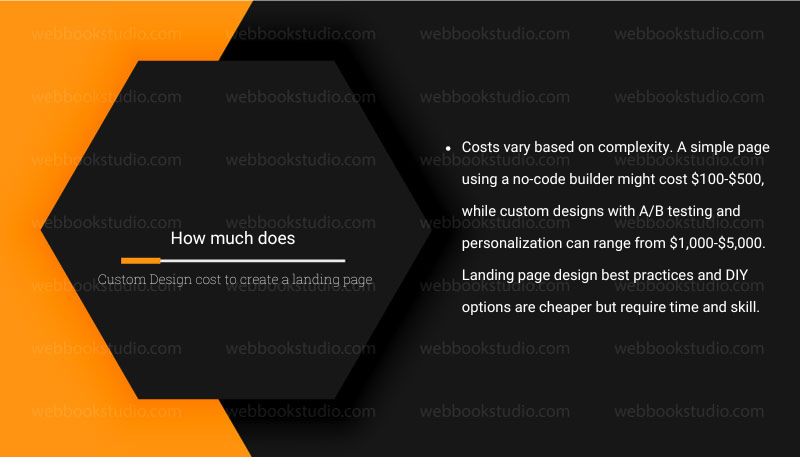
Costs vary based on complexity. A simple page using a no-code builder might cost $100-$500, while custom designs with A/B testing and personalization can range from $1,000-$5,000. Landing page design best practices and DIY options are cheaper but require time and skill.
3. Why is mobile optimization so important?
With over 53% of web traffic from mobile devices, a non-optimized page risks high bounce rates. Mobile-first design ensures fast load times, easy navigation, and a seamless user experience, which is critical for capturing on-the-go users.
4. How could you improve Your Landing page’s conversion rate?
Focus on clear copy, strong CTAs, social proof, and A/B testing. Address user objections with testimonials or trust badges, and use urgency tactfully. Testing different headlines or button colors can reveal what resonates best.
5. What tools should I use for landing page design?
Popular no-code/low-code tools include Unbounce, Wix, Webflow, and Squarespace. For analytics and testing, use Google Analytics or Optimize. AI tools like Persado or Dynamic Yield can enhance personalization.
6. How do I start a landing page design business?
Landing page design best practices and beginning professional journey with a no-code platform, build a portfolio, and offer services on freelance platforms. Specialize in a niche, stay updated on trends, and market your expertise through blogs or social media. Networking also connects you with potential clients.