Discover How To Conform Creativity And Usability In Visual Interface Design?
Visual Interface Design (VID) sits at the heart of our digital world, shaping how we interact with apps, websites, and devices every day. As we step into 2025 market size value in US$ 4.11 billion in 2024, Growth Rate CAGR of 8.1% from 2024 to 2033. Forecast Period 2025 – 2033 Market Size Value By US$ 7.24 Billion by 2033. The demand for interfaces that are both eye-catching and easy to use has never been higher.
If you’re scrolling nonstop through a shopping app or navigating a smart home dashboard, the design you experience can either delight you or leave you frustrated. Crossing the right balance between creative power and usability is no small feat—it’s a craft that requires insight, skill, and a deep understanding of human behavior. Why Visual Interface Design (VID) balance matters, how to achieve it, and what it means for designers and businesses in today’s market. Let’s dive into VID discovery.
Introduction to Visual Interface Design.
Visual Interface Design (VID) is the art of crafting the look and feel of digital screens—think buttons, layouts, colors, and typography. It’s what you see when you open your phone or log into a website. But it’s more than just pretty pictures; it’s the bridge between a user and the technology they’re using. A well-designed interface doesn’t just catch your eye—it guides you effortlessly to what you need.
In 2025, this field is evolving fast. With augmented reality (AR), voice controls, and AI-driven personalization becoming mainstream, designers face new challenges and opportunities. So, what is the goal of UX/UI design? Create interfaces that stand out in a crowded digital world while remaining reflexive. This dual demand for creativity and usability is what makes visual interface design such a dynamic and rewarding space.
The stakes are high. A clunky interface can drive users away, while a stunning but confusing one can do the same. Businesses know this—poor design can tank customer satisfaction and revenue. That’s why mastering this balance isn’t just a skill; it’s a competitive edge.
Understanding Usability in Visual Interfaces
The global User Interface (UI) Design market was valued at $2.43 billion in 2024 and is projected to reach $8.55 billion by 2033, growing at a CAGR of about 15.01%. Understanding user needs can create unique designs that are both innovative and easy to navigate. Creative elements should improve the user experience, not complicate it. Testing with real users ensures that graphic design creative ideas don’t hinder usability. Go too far in either direction, and you risk losing your audience through confusion or boredom. Here’s a more detailed breakdown:
Key Drivers: Conform Creativity And Usability In Visual Interface Design (VID).
- Increasing need for user-friendly interfaces and better customer experiences across various industries.
- The broad variety of applications in numerous industries, including software and apps, web pages, and games.
Related Markets Demand For Visual Interface Design And UI/UX Design:
- Graphical User Interface (GUI) Design Software: Valued at USD 885.80 million in 2022, projected to reach USD 2,071.64 million by 2031, growing at a CAGR of 9.90%.
- UI/UX Market: Estimated at USD 2.20 billion in 2025, UI/UX design is expected to reach USD 9.28 billion by 2030, at a CAGR of 33.35%.
- UX Services Market: Projected to grow from USD 6.40 billion in 2025 to USD 54.93 billion by 2032, exhibiting a CAGR of 36% during the forecast period.
- 3D User Interface Design Market: Forecast to reach $7.8 billion by 2026, growing at a CAGR of 21.3% from 2021 to 2026.
- Website User Interface Design Market: Projected to touch USD 0.13 Billion by 2032, at a CAGR of 12.3%.
Importance of Creativity in Visual Interface Design (VID) Business Impacts.
Creativity is the spark that sets visual interface design (VID) apart. It’s the bold color palette, the unexpected animation, or the clever layout that makes you stop and take notice. In a world where focus is on digital content, creativity is what grabs attention and keeps users engaged.
Usability is all about making things work for people. It’s how quickly you can find the “buy now” button or figure out how to mute a video call. In visual interface design (VID), usability means the layout, icons, and text all make sense at a glance. If you’re squinting at tiny fonts or hunting for a menu, the design has failed this test.
Good usability is rooted in human psychology. Things positivity business wired to prefer simplicity—our brains process clear patterns faster than confusion. Most experienced VID and UX/UI designer, company leader in user experience research, and defines usability by five features: learnability, efficiency, memorability, error prevention, and satisfaction. A usable interface checks all these boxes.
Why is visual interface design (VID) critical? Because frustration kills engagement. If an app takes too long to figure out, users bounce—fast. In e-commerce, for example, a confusing checkout process can slash conversion rates by up to 35%, according to Baymard Institute studies. In 2025, with attention spans shrinking and options multiplying, usability isn’t optional; graphic design is a survival skill for businesses. The trick is weaving usability into a design without stifling creativity. It’s not about choosing one over the other; it’s about making them dance together.
Informative article: Mobile application design agencies and the agile development process.
5 Top Key Principles of Visual Interface Design Success With Examples.
To pull off this balancing act, you need a solid foundation. Here are the core principles that let’s look at real-world wins that decide made balance: visual interface design:
1. Visual Order: The Art of Balance with Blending Creativity and Function in Visual Interface Design.
This is about directing the eye. Bigger, bolder elements—like a bright “Sign Up” button—signal importance. Subtle cues, like smaller text, fade into the background. It’s how you tell users what to do first without saying a word.
2. Consistency Unique Creativity vs. Usability: Can You Really Have Both in Visual Interface Design?
Uniform fonts, colors, and button styles create a predictable experience. If every page looks different, users get disoriented. Consistency builds trust and speeds up navigation.
Duolingo: This language app turns learning into a game with quirky characters and lively colors. Yet, the progress bar and bite-sized lessons keep it dead simple. Duolingo is creative enough to hook you, usable enough to keep you coming back.
3. Contrast: Balancing Creativity and Usability in Visual Interface Design (VID)
Dark text on a light background or a vivid icon against a muted field—contrast makes things pop. It’s not just aesthetic; it ensures readability and accessibility, especially for visually impaired users.
Notion: A productivity tool is both sleek and functional. Notion tool’s customizable templates let users flex their creativity, but the drag-and-drop interface ensures it’s never confusing.
4. Simplicity: When Creativity Goes Too Far in Visual Interface Design.
Less is more. A clean layout with plenty of white space feels calm and focused. Clutter overwhelms; simplicity invites exploration.
Airbnb: Their interface is a masterclass in simplicity and charm. Airbnb’s clean layouts and warm photography draw you in, while clear filters and a prominent “Book” button make it a breeze to use. Creativity serves the goal: finding a way.
5. Feedback: Are You Sacrificing Usability For Creativity In Visual Interface Design?
When you tap a button, it should react—maybe it changes color or clicks. This instant response confirms the action, keeping users in control.
These principles aren’t new, but in 2025, balancing creativity and usability in mobile website design is an art of restraint and intention. It involves adapting to trends like micro-interactions (tiny animations) and inclusive design. These principles are the backbone of balancing creativity and usability—flexible enough for flair, firm enough for function.
11 Tips for Visual Interface Design (VID) Balancing Invention and Usability.
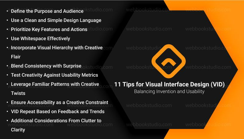
If you’re a UI/UX designer, product manager, or brand strategist, this is your battleground. You want a user experience that wows and works—where aesthetics don’t compromise function, and usability doesn’t dull innovation. Here is the breakdown of practical strategies to help you master the art and science of visual interface design (VID).
1. Define the Purpose and Audience.
- Why It Matters: The purpose of the interface is like e-commerce, portfolio, educational tool, and the needs of your audience search as tech-savvy millennials, older adults, and creative professionals. Set the foundation for how much creativity you can infuse without sacrificing usability.
- How to Implement: Conduct user research to identify preferences, pain points, and expectations. For example, a younger audience might appreciate bold, experimental designs, while a professional audience might prioritize clarity and efficiency.
- Added Tip: Create user personas and map out their goals to align creative choices, vibrant colors, usability needs, and legible text.
2. Use a Clean and Simple Design Language
- Why It Matters: A minimalist design reduces cognitive load, making it easier for users to navigate while providing a canvas for creative flourishes.
- How to Implement: Stick to a consistent color palette, typography, and iconography. For instance, use a sleek sans-serif font for readability and pair it with a single creative accent, like an animated button or unique illustration.
- Added Tip: Leverage design systems like Material Design or custom guidelines to maintain simplicity while allowing room for creative deviations in non-critical areas, like decorative headers.
3. Prioritize Key Features and Actions For Visual Interface Design (VID)
- Why It Matters: If users can’t quickly find or use core functionalities, no amount of creativity will save the design from frustration.
- How to Implement: Apply the “order of needs” principle—place critical buttons (“Buy Now,” “Submit”) in principal, predictable locations. Cover them with creative touches, like subtle hover animations or gradient backgrounds, that improve rather than obscure.
- Added Tip: Use contrast and size to highlight key actions (bold call-to-action button) while reserving intricate details for secondary elements, like background patterns.
4. Use Whitespace Effectively
- Why It Matters: Whitespace (or negative space) prevents clutter, improves readability, and highlights both creative and functional elements.
- How to Implement: Space out UI components to create breathing room—e.g., generous padding around text blocks or images. Use whitespace to frame a creative focal point, like a hero image, without overwhelming the user.
- Added Tip: Experiment with asymmetrical whitespace for a modern, creative vibe, but ensure it doesn’t disrupt the natural flow of navigation (left-to-right reading patterns in Western cultures).
5. Incorporate Visual Hierarchy with Creative Flair
- Why It Matters: A clear visual order guides users through the interface intuitively, while creative styling keeps it engaging.
- How to Implement: Use size, color, and placement to rank elements by importance (larger headings, brighter buttons). Add creative twists like hand-drawn icons or micro-animations to draw attention without confusing the order.
- Added Tip: Test your hierarchy with users to ensure creative elements (a stylized scrollbar) don’t overshadow essential navigation cues.
6. Blend Consistency with Surprise
- Why It Matters: Consistency ensures usability by making the interface predictable, while surprises (unexpected creative elements) delight users and make the experience memorable.
- How to Implement: Maintain consistent layouts, button styles, and navigation patterns across screens. Introduce surprises sparingly, a playful loading animation or a unique illustration on a confirmation page.
- Added Tip: Limit surprises to moments of low cognitive demand after a task is completed, to avoid distracting users during critical actions.
7. Test Creativity Against Usability Metrics
- Why It Matters: What looks creative to a designer might confuse or alienate users, so validation is key.
- How to Implement: Conduct usability testing with prototypes to measure task completion rates, time on task, and user satisfaction. For example, if a creative radial menu slows users down, simplify it while retaining its unique aesthetic.
- Added Tip: Use A/B testing to compare a creative design against a more conventional one and analyze which performs better for your audience.
8. Leverage Familiar Patterns with Creative Twists
- Why It Matters: Familiar design patterns like hamburger menus, card layouts are instantly usable, and small creative enhancements can make them stand out.
- How to Implement: Start with a standard layout users already know, then layer on creative elements like a gradient-filled hamburger icon or a card with a subtle tilt effect.
- Added Tip: Avoid reinventing core interactions, don’t replace a scrollbar with a custom gesture unless testing proves it’s intuitive for your audience.
9. Ensure Accessibility as a Creative Constraint
- Why It Matters: Accessibility isn’t just a usability requirement—it’s an opportunity to channel creativity into inclusive design.
- How to Implement: Use high-contrast colors for readability, scalable fonts for different devices, and alt text for images. Get creative within these constraints, like designing unique focus states for keyboard navigation.
- Added Tip: Explore tools like color blindness simulators to ensure your creative palette works for all users.
10. Visual Interface Design (VID) Repeat Based on Feedback and Trends.
- Why It Matters: Design trends evolve, and user feedback reveals what works, allowing you to refine the balance over time.
- How to Implement: Stay updated on UI trends (neumorphism, glassmorphism) and adapt them to your interface without compromising usability. Collect user feedback via surveys or analytics to tweak creative elements.
- Added Tip: Use heatmaps to see where users focus—adjust overly creative areas that distract from key interactions.
11. Additional Considerations From Clutter to Clarity: Mastering Visual Interface Design with Purpose.
- Emotional Impact: Creativity can evoke emotions (joy from playful animations), but overdoing it might frustrate users. Aim for a tone that matches the interface’s purpose—professional for a banking app, whimsical for a gaming site.
- Performance: Creative elements like animations or high-resolution images can slow down an interface. Optimize assets (e.g., compress images, use CSS animations over JavaScript) to preserve usability.
- Contextual Creativity: Tailor the level of creativity to the platform—mobile users prioritize speed and simplicity, while desktop users might tolerate more elaborate designs.
Relevant article: The use of animation in modern graphic design.
Conclusion: Understanding Visual Interface Design: The Balance Between Creativity and Usability.
Visual interface design (VID) improves at the intersection of creativity and usability, where fine arts and functionality combine to deliver exceptional user experiences. Achieving this balance requires a deep savvy of your targeted audience, a commitment to simplicity, and a strategic approach to integrating innovative elements without compromising accessibility or efficiency.
Creativity brings personality and delight through bold visuals, unique animations, or unexpected details, while usability ensures that users can navigate and achieve their goals with ease. By prioritizing key actions, leveraging familiar patterns with fresh twists, and repeating based on user feedback, designers can craft interfaces that are both inspiring and reflective.
Get in touch with experienced graphic designers whose art of visual interface design keeps in knowing! When to push creative boundaries and then to anchor them in the principles of usability, creating a seamless blend that wins users while empowering them to succeed.
FAQs: Unlock The Secrets To Effective Visual Interface Design Strategies Today.
1. What is Visual Interface Design (VID) Or UI Design?
Visual Interface Design (VID), or UI Design, focuses on the visual and interactive elements of a digital product, like apps or websites, to create a user-friendly and engaging experience, including aspects like layout, color, typography, and interactivity.
2. Why is balancing creativity and usability so hard?
It’s a tug-of-war between freedom and rules. Creativity wants to break boundaries; usability demands structure. The challenge is finding overlap where both shine—testing and user focus help.
3. How do I start a business in this space?
Pick a niche, build a portfolio, and network with tech firms. Understand your market—AR needs hardware ties, accessibility needs regulatory know-how. Start small, prove value, then scale.
4. What tools should we use in 2025?
Figma’s still king for collaboration, but watch AR tools like Lens Studio or Spark AR. AI platforms like Adobe Firefly can spark ideas fast.
5. What’s the future of this balance?
There will be more personalization and immersion, driven by AI (Artificial Intelligence) and Augmented Reality (AR). But the core visit design must look good and work well, no matter the tech.
6. Is UI design a skill?
User Interface (UI) design skills involve creating visually appealing and user-friendly digital interfaces. That requires a deep understanding of design principles, fine arts, and user behavior to craft an interface reflexive and easy to navigate.
7. Is UI design high-paying?
The average salary of a UX designer in the United States is $84k per year. On the UI side of things, the average salary of a UI designer in the United States is $94k per year.