Why Most Graphic Design Portfolios Fail to Influence Clients?
A unique sample portfolio for graphic design is what many designers seek when they feel stuck or unsure how to showcase their work. Most graphic design profiles fail to overcome clients because they prioritize aesthetic, “polished” visuals over communicating problem-solving skills, business value, and unique strategic thinking.
Most clients generally hire for solutions to business problems, such as increasing sales, improving brand recognition, or increasing user experience, rather than just “pretty” artwork. You may have good designs. But your graphic designer profile may still not impress clients.
Your portfolio (Professional profile) isn’t just a collection of work; it’s your primary sales tool. Clients scan dozens of options before deciding who to hire, and a standout layout can make the difference between getting overlooked and landing that next big project.
Often, the problem is not a lack of skill. It is the portfolio layout. A messy page, weak project text, or no clear order can hurt even great work. Clients want clean pages. They wanta simple flow. They want fast proof that you can solve problems.
By studying strong graphic design profile examples, you can know what works. Some use a grid layout. Some use a case study style.
Even a student or beginner can build a professional profile that looks ready for a job application. You just need the right structure, tools, and ideas.
What Clients Actually Look for in a Graphic Designer Profile?
The graphic design market is booming, valued at over $45 billion globally last year, with projections for steady growth as businesses digitize. In the US alone, demand for skilled designers rose 5% annually, driven by e-commerce and social media needs.
Clients do not study every detail. They scan fast, open a graphic designer’s profile, and decide in seconds. They check the layout. Is the portfolio design clean? Is it easy to move through? A clear portfolio layout builds trust right away.
A strong layout demonstrates your ability to organize complex information, much like how you’d handle a client’s campaign. The reason?
The client looks for strong samples and wants real graphic designer work examples, not random art. Good graphic design portfolio examples show branding, typography, mockups, or web design. Each project should have a short story. What was the goal? What was the result? This shows your thinking, not just your style.
Clients also want order. A smart portfolio structure guides them from intro, projects, and contact. A sample professional profile for graphic design works for a portfolio website, or even a printed book made with Adobe InDesign or InDesign templates. Simple flow makes your work feel expert.
Most importantly, they want proof that you can help them. The best professional graphic design portfolio examples show clear results, clean visuals, and strong presentation. When your features are easy to scan and easy to trust, clients stay longer, and they remember you.
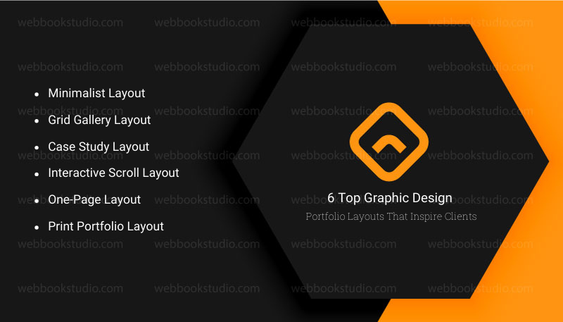
6 Top Graphic Design Portfolio Layouts That Inspire Clients
The right graphic design portfolio layout can change how clients see your work. A smart layout makes your skills clear fast. It guides the eye. It keeps people looking. Below are proven layouts used in the best graphic design qualifications examples and professional graphic design portfolios.
1. Minimalist Layout
Minimalist layout is simple and clean. Lots of space. Few colors. One project at a time. Clients like it because it feels calm and easy to read. It works well for branding, logo design, and typography designers. Many creative graphic design portfolios use this style to show confidence.
2. Grid Gallery Layout
This layout shows many works in a neat grid. Clients can scan fast and pick what to view. It is great for designers with many samples. Grid gallery layout style is common on portfolio websites and Behance-style pages.
3. Case Study Layout
Case study layout is a favorite in top graphic designers’ portfolios. Each project tells a story. Problem, Process, and Result. Clients love this because it shows how you think. It works best for job seekers and freelancers who want serious projects.
4. Interactive Scroll Layout
This layout moves as users scroll. An interactive scroll layout may have motion, transitions, or effects. It feels modern. Many UI and web designers use it on popular advanced graphic designer websites.
5. One-Page Layout
All work sits on one long page. Simple, Fast, Clear. This is perfect for freelancers or beginners making their first fresher graphic designer portfolio or business professional profile.
6. Print Portfolio Layout
Some clients still ask for a physical book. A printed portfolio PDF made with Adobe InDesign or InDesign templates can look very professional. Clean pages and strong order matter most here.
Key Tip: The best layout is not the fanciest one. A sample portfolio for graphic design is one that makes your work easy to see, easy to understand, and easy to trust.
5 Top Portfolio Layouts to Inspire Clients
Choosing the right layout depends on your style and audience. Below, we explore proven options, with reasons rooted in user behavior and design principles. Each includes examples and implementation tips for a “sample portfolio for graphic design.”
1. Grid Layout: Structured and Versatile
The grid layout arranges projects in uniform rows and columns, like a tidy gallery wall. It’s popular because it creates order amid variety, allowing clients to scan. Psychologically, grids evoke stability, think magazine spreads or Instagram feeds, making your work feel professional and approachable.
- Why it impresses: In fast-paced browsing, grids load efficiently, reducing bounce rates by 20% according to web analytics. For US clients in corporate sectors, it signals efficiency worldwide, and it’s adaptable to different screen sizes. Equal spacing highlights each piece without favoritism, ideal for diverse portfolios.
- Example: Azwedo uses a 3×3 grid to display logos and print designs, with hover effects revealing details. This keeps the page clean while adding interactivity.
- Another: Draftline’s grid for branding projects, where thumbnails expand into case studies.
- To implement: Use tools like Adobe XD or Figma for prototypes. Solution for beginners: Start with 4-6 items per row on desktop, collapsing to 2 on mobile. If servicing clients, offer grid-based mockups that are easy to customize.
2. Masonry Layout: Dynamic and Eye-Catching
Masonry mimics Pinterest’s uneven grid, where items stack like bricks, filling space organically. It’s unique because it accommodates varying image sizes without cropping, preserving your designs’ integrity.
- Why Effective: It creates visual flow, guiding eyes naturally, and studies show 35% higher engagement than rigid grids. In 2026, with AI curating content, masonry adapts to dynamic updates, keeping portfolios fresh. For mass audiences, it’s forgiving of irregular content, like mixed media.
- Facts: Vertical stacking prioritizes taller pieces, emphasizing keywords. Worldwide, it’s mobile-friendly, reducing scroll fatigue.
- Example: Kummerow Studios employs masonry for illustrations and motion graphics, where asymmetric heights draw attention to standout projects. Igloo Media’s version mixes photos and vectors, creating a narrative flow.
- Implementation: Code with CSS Grid or libraries like Masonry.js.
Tip: A sample portfolio for graphic design also groups similar projects thematically. For services, suggest this to clients with eclectic work, scalable and modern.
3. Full-Screen Layout: Immersive and Bold
Full-screen layouts dedicate the entire viewport to one project at a time, often with slideshow navigation. It’s impressive for its drama clients feel immersed, like flipping through a high-end book.
- Why effective: It minimizes distractions, focusing on quality over quantity. Data from UX design sites indicates 50% longer dwell times. In the US, it’s great for luxury brands globally to handle high-res images without lag.
- Reason: By dominating the screen, it conveys confidence in your work.
- Drawback: Requires strong visuals to avoid emptiness.
- Example: James Jennings uses full-screen for packaging designs, with subtle arrows for navigation. Villo’s portfolio transitions smoothly between branding mocks, enhancing storytelling.
- To build: Use HTML5 full-screen APIs or platforms like Wix.
- Solution: Optimize images for load speed, compress without losing detail. Ideal for client services emphasizing impact.
4. Card Layout: Modern and Interactive
Cards are boxed elements with images, titles, and descriptions, often in a responsive grid. They’re unique for modularity and easy to rearrange.
- Appeal: Cards mimic app interfaces, familiar to clients. Engagement rises 25% with clickable elements.
- Reason: Each card acts as a mini-pitch, scalable for growth.
- Example: Merry rose cards for illustrations, with shadows for depth.
- Implementation: Bootstrap or custom CSS. For services, it’s quick to prototype.
5. Horizontal Scrolling Layout: Innovative and Narrative
Horizontal scrolls move sideways, like a timeline. It stands out for storytelling flow.
- Why: Breaks vertical norms, increasing memorability by 30%.
- Example: Tony’s uniform cards in horizontal view.
- Tip: Ensure smooth performance.
Tools to Create a Professional Skillset Quickly
Building a strong graphic designer portfolio is easier with the right tools. Sample portfolio for graphic design with a feature PDF or a curriculum vitae website. Do these tools save time and give a polished look?
| Tool / Platform | Best For | Type of Portfolio | Key Benefits | Notes / Tips |
| Adobe InDesign | Professionals & students | PDF / Print | Clean layouts, precise control, professional look | Use InDesign templates for faster design; great for printed skillsets |
| Canva | Beginners / Students | PDF / Web | Easy drag-and-drop, pre-made templates, quick results | Ideal for a fresher graphic designer’s skillset, simple to edit |
| Wix | Freelancers / Online portfolios | Website | Customizable curriculum vitae galleries, client-friendly | Great for skills profile websites, works for beginners and pros |
| Squarespace | Freelancers / Agencies | Website | Professional design templates, mobile-friendly | Use for clean graphic designer profile websites, smooth navigation |
| Portfoliobox | Freelancers / Students | Website | Easy to set up, curriculum vitae-focused, responsive design | Works well for creative graphic design portfolios minimal learning curve |
Tip for a sample portfolio for graphic design: Choose your tool based on the curriculum vitae type. Use PDF if you need something downloadable or printable. Use a website if you want clients to explore your work online. The right tool makes your portfolio look professional and impressive.
Common Portfolio Mistakes That Instantly Turn Clients Away
Even strong designers lose clients because of simple mistakes in their graphic design curriculum vitae. Avoid these errors to make your features shine.
- Cluttered Layouts: Too many projects or crowded pages make it hard to focus. A messy portfolio layout hides your skills.
- No Project Descriptions: Clients want to know the goal, process, and result. Without notes, your graphic designer’s work examples lose impact.
- Inconsistent Design: Different fonts, colors, and styles make a curriculum vitae feel unprofessional. Strong creative graphic design portfolios keep design consistent.
- Slow Websites: Online curriculum vitae websites that load slowly frustrate viewers. Clients leave fast if your work isn’t accessible quickly.
- Missing Contact Info: Even a beautiful curriculum vitae or professional website fails if clients don’t know how to reach you. Always include a clear contact section.
- Showing Everything: Too many projects overwhelm clients. Focus on your strongest work. Less is more in both business and professional graphic design portfolios.
Tip for a sample portfolio for graphic design: Check your skill sets as a client would. Scan for clarity, readability, and flow. Fix these mistakes, and even a fresher graphic designer curriculum vitae can make a strong impression.
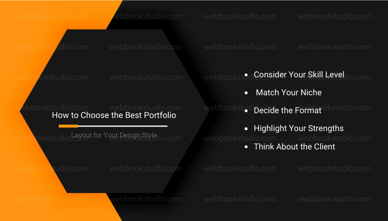
How to Choose the Best Portfolio Layout for Your Design Style?
Not every graphic design portfolio layout works for every designer. Choosing the right one depends on your style, experience, and audience.
- Consider Your Skill Level
- Beginners or students should keep it simple. A one-page layout or minimalist portfolio layout works well. It keeps projects clear and easy to follow.
- Professionals can use case study layouts or interactive scroll layouts to show depth and process.
- Match Your Niche
- Branding and logo designers shine with grid layouts or minimalist PDFs.
- UI/UX designers may benefit from interactive online portfolios to show B2B Digital Marketing Services in context.
- Decide the Format
- Curriculum vitae PDFs are great for downloadable submissions or interviews.
- Profile websites work best if you want clients to explore your work online.
- Printed portfolios still impress in in-person meetings.
- Highlight Your Strengths
- Pick a layout that shows your best projects first.
- Use consistent colors, fonts, and spacing.
- Organize work logically: intro → projects → contact.
- Think About the Client
- Clients skim fast. Make navigation simple.
- Prioritize readability and clarity over fancy effects.
Tip for a sample portfolio for graphic design: The best creative graphic design Professional is the one who makes your work easy to see, understand, and remember. A layout should match your style while guiding the client smoothly through work.
Step-by-Step: How to Create a Graphic Design Portfolio From Scratch?
Before sending your sample portfolio for graphic design to clients, check that it’s complete and professional. This simple checklist helps you catch mistakes and improve impact.
| Step | Action | What To Do | Why It Matters |
| 1 | Define Your Niche | Choose your focus on branding, web, UI/UX, or print. Shape your portfolio layout around it. | A clear niche makes your sample portfolio for graphic design look focused and professional. |
| 2 | Select Your Best Work | Pick 5–8 strong graphic design work examples that show creativity and skill. | Clients prefer a few strong projects over many weak ones. |
| 3 | Choose the Right Layout | Decide between a profile PDF, website, or printed book. Use tools like Adobe InDesign, Canva, Wix, or Squarespace. | The right format improves presentation and user experience. |
| 4 | Write Short Project Descriptions | Explain each project’s goal, process, and result in simple words. | Shows your thinking, not just your visuals. |
| 5 | Add Proof & Testimonials | Include client feedback, results, or before–and–after images. | Proof builds trust and credibility. |
| 6 | Optimize Navigation & Design | Use headings, spacing, and consistent fonts and colors. | A clean structure makes your curriculum vitae easy to scan. |
| 7 | Publish or Export | Export high-quality PDF, test websites on devices, or print neatly. | Final polish ensures a professional first impression. |
Tip for a sample portfolio for graphic design: Follow these steps, and even a fresher or entry-level skill set can look polished, clear, and client-ready.
Conclusion: The Secret Behind Portfolios That Win Clients
The layouts you choose matter. A minimalist portfolio layout, a case study layout, a grid gallery, or a curriculum vitae website, clarity and structure are key. Even a student’s or entry-level graphic design professional skills can impress with clean, organized, and focused results.
Using tools like Adobe InDesign, Canva templates, or website builders like Wix and Squarespace makes creating a professional profile faster and easier. Pay attention to strong visuals, consistent design, and concise project descriptions. Avoid clutter and unnecessary details.
Clients judge professional profiles fast, and a clear, well-structured, and visually appealing creative graphic design portfolio makes a lasting impression. When you follow these steps and choose the right layout, your curriculum vitae doesn’t display work. But also sells skills, thinking, and professionalism.
A strong sample portfolio for graphic design does more than show your work tells a story. Focus on quality, not quantity. A strong entry-level graphic design portfolio example can open doors faster than a long, messy one. It guides clients from your introduction to your best graphic design work examples and ends with an easy way to contact you.
However, pick your best projects, choose a layout that suits your style, and start building your features today. The right presentation can open doors to the clients and opportunities you want.
FAQs: Sample Portfolio for Graphic Design That Impresses Clients
1. What should a graphic design portfolio contain?
A strong graphic design curriculum vitae should include a short intro, an about section, 5–8 selected projects, short project descriptions, proof or results, and clear contact info. Use a clean portfolio layout to guide clients.
2. How many projects should I include in my profile?
Sample portfolio for graphic design, try focus on quality over quantity. For most sample portfolios for graphic design, 5–8 strong projects are enough. Too many can overwhelm clients.
3. Is a PDF Portfolio Better than a Website?
It depends. A skill set profile PDF is great for job applications or interviews. A portfolio website works best for online exploration and interactive projects. Some designers use both.
4. What is the best layout for a beginner designer?
Beginners should use simple layouts, such as minimalist or one-page portfolios. Keep sections clear and focus on a few strong projects.
5. How do I make my portfolio stand out?
Highlight your best graphic design work examples, include short project descriptions, use consistent colors and fonts, and pick a clean portfolio layout. Adding proof, results, or testimonials also helps.
6. How often update the portfolio?
Every 3-6 months with fresh work; refresh layout yearly to stay current.
7. Can one layout fit all design specialties?
No, minimalist suits branding pros vibrant for illustrators storytelling for strategists. Match to your niche.